

Every IoT product team eventually faces the same temptation: “Let’s build a dashboard.”
It sounds logical. After all, data is the heartbeat of IoT — and dashboards promise control, visibility, and insight. But in practice, most dashboards don’t deliver on that promise.
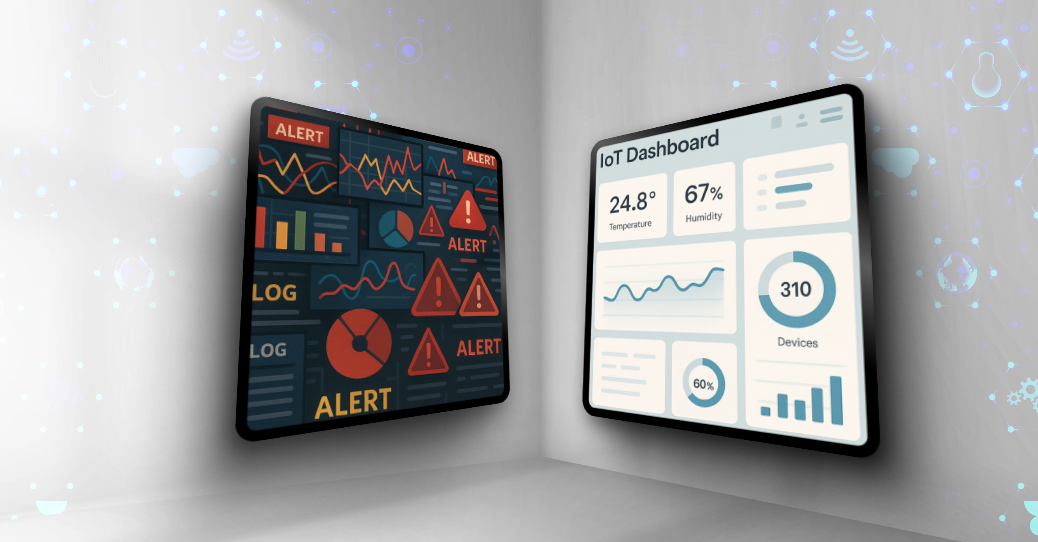
They start out as helpful visual summaries and end up as cluttered control panels — crowded with metrics no one uses, graphs no one understands, and buttons no one clicks.
The alternative is IoT dashboard design that adapts to workflows and scales with complexity — giving users tools they actually trust and adopt.
The problem isn’t that teams don’t care about users. It’s that they try to serve every user with one view. What’s meant to simplify instead overwhelms. The result? Low adoption, frustrated operators, and costly support cycles that drain both time and trust.
It’s time to ask a harder question:
Do we really need another dashboard — or do we need an experience that understands context?
In this piece, we’ll unpack why traditional IoT dashboards fail, how to move beyond static screens, and what it takes to design data experiences that actually drive adoption, clarity, and confidence.
The alternative is to move beyond static dashboards and design contextual, customizable experiences that adapt to each user’s workflow and scale with complexity.
Our client came to us with a familiar setup: a single dashboard meant to cover every use case. Packed with data from innumerable sources, it was expected to serve field security admins with very different needs. Requirements stretched from shop-level installations to enterprise-scale safety and security monitoring.
The result was predictable.
Even the client wasn’t sure what the dashboard was meant to be. Was it an alarm console? A data hub? A reporting tool? Without clear focus, it became all of them and, in the end, none.
This is the trap many product teams fall into: building a dashboard as a catch-all, instead of designing user flows that match how different users actually work.
When we were first brought into the project, the assignment sounded straightforward: “Redesign the dashboard.”
But very quickly, it became clear the problem wasn’t just visual polish. The real challenge was that the dashboard had no clear purpose. It was a dumping ground for data, not a tool for decisions.
Rather than patching the old approach, our lead designer flipped the perspective. Instead of asking, “How do we redesign the dashboard?” he delved into the data and developed a clearer understanding of the underlying layers — how they connected, how they should be structured, and how they could be presented in a way that supported real use. That shift in focus set the stage for the core questions that ultimately bring data to life:
The project transformed from cosmetic UI fixes into rethinking information architecture and user flows. We created an experience that supported real decisions, rather than simply displaying more data.
The layers of data, such as alarms, troubles, system health, and maintenance needs, were mapped and ranked by urgency and relevance. Alarms, for example, had to surface instantly, while secondary details could be tucked into customizable widgets that users could call up when needed.
In other words, the team wasn’t building a dashboard. We were building a contextual experience that adapted to each user’s role, priorities, and situation.
Once the problem was reframed and the workflows mapped, the path forward became clearer: the new experience had to be dynamic, customizable, and use case-specific.
Security admins don’t all work the same way. Some manage dozens of large units, others handle a handful of smaller installations. But both needed a tool that could flex to their reality.
Instead of forcing every admin to stare at the same fixed layout, we introduced a customizable and interactive interface:
Instead of being forced into a one-size-fits-all dashboard, admins now had a tool they could make their own. That flexibility didn’t just improve usability — it created the sense of a tailored, professional experience. The best part? The same system worked just as well for a small business with three detectors as it did for a security company managing fifty shopping centers.
The critical business insight: use flexibility to improve usability and build trust. When a product feels like it was designed to fit your workflow, adoption skyrockets.
Cracking the ‘dashboard mega equation’
Security admins often manage multiple units, each with overlapping systems. That overlap risked producing duplicate or contradictory data in the dashboard. If not handled correctly, it could break both the logic and the visual design.
The team took an unconventional creative approach and the custom mathematical equation and logic system were born. They ensured the data always added up in a meaningful way. Moreover, the UX solution made sure the logic data display never hurts the visual requirements for the interface.
The results? No matter how complex the input, the widgets stay readable, balanced, and scalable. Whether showing three detectors in a small shop or fifty cameras in a large installation, the system keeps the view clear and usable.
The equation protected the integrity of the data, while the design system guaranteed that admins always saw information in a form they could act on immediately.
For security admins, scale is unpredictable. One day they’re setting up a small office with a few sensors, the next they’re managing a retail chain with hundreds of cameras and alarms. The dashboard had to work equally well in both cases.
That created a tough design challenge: how do you present very little or massive amounts of data in a clear, user-friendly way without the interface breaking?
By incorporating visual resilience into every widget:
The final result was a system that never looked crowded or empty, but was always readable. For users this meant confidence that they are equipped not with a dashboard, but with a tool built to scale with them, not against them.
The beauty and the tech
Once scalability was solved, the next challenge was tone. Security admins deal with technical systems every day, but their tools shouldn’t feel cold or intimidating.
We focused on:
As a result, the dashboard combined technical resilience with a human touch, transforming from “just a control panel” into a trusted companion in the field.
Conclusion: The End of the Dashboard Era — and the Start of Contextual UX
The truth is, dashboards were never the end goal. They were a phase — a step toward something more human, more adaptive, more aligned with how people actually work.
For years, we treated dashboards as trophies of progress: the more widgets, the more data, the better. But in IoT, where complexity scales fast, that mindset breaks. Users don’t need more data — they need the right data, at the right moment, in the right form.
That’s what contextual, customizable design delivers. It turns data into decisions, interfaces into allies, and dashboards into experiences users actually trust.
If your product’s dashboard feels more like a junk drawer than a decision tool, it’s time to rethink what it’s really there to do — and who it’s really there for.
Because in the end, successful IoT design isn’t about showing everything.
It’s about showing what matters — beautifully, clearly, and in context.
👉 Your dashboard shouldn’t just display data. It should drive understanding. Let’s Talk IoT UX →
At first glance, a dashboard redesign can look like a purely cosmetic exercise. But in reality, a contextual, user-focused tool isn’t just a UX upgrade, but a measurable business result.
Here’s why:
For product owners and managers, the message is simple: the quality of your user tools directly influences adoption, customer satisfaction, and long-term business growth.
If your IoT product still relies on a static dashboard, here are the principles to rethink before the next release:
Think of design as ROI. A tool that reduces training time and builds trust in demos is just as valuable as new features.
They try to serve every user with one screen, creating clutter and confusion instead of clarity.
Contextual, role-based tools that adapt to workflows instead of forcing all data into one screen.
Users trust tools that reflect their reality. Customization lets them prioritize what matters, boosting adoption.
By using modular visualizations, prioritization rules, and resilient layouts that work from 3 to 300+ devices.
Reduced training, faster adoption, lower support costs, stronger trust, and scalability for future growth.

Our friendly team would love to hear from you.
By submitting this form you agree with our Privacy Policy

